Appearance
Welcome to all you need to know about this site!
STILL IN DEVELOPMENTThis page demonstrates the plugins used to help create this site as well as some of the built-in markdown extensions provided by VitePress.
If there's anything you feel could be improved, or if you have any suggestions or concerns about a feature, please feel free to at any time. Your input helps us make things better for everyone!
Plugins
Medium Zoom
This plugin allows images to be scaled to a lower width or height and be clickable to expand to the original size. An invaluable asset for creating documents, as we don't want pictures to be huge when scrolling, but have the ability to be viewed full-view if they're rendered small.
You can also scroll, and it will automatically go back down to its pre-set size without having to click, neat right?
EXAMPLE
The image below is placed force to a width of: 450px with the code of width="450" at the tailing end of <img src=>
html
<img src="https://not-so-cool.com/albums/nz/bethells%20Beach/DSC018122.jpg" width="450">
Image credit: Me, lol. shameless self promotion
But clicking on the image it will expand to it's original size of 1084x723
Image Carousel
The idea here is when creating a step-by-step photo guide that we try and avoid endless vertical scrolling when there's a large number of photos to show. Instead, it offers a more organised experience by bunching the photos and allowing a horizontal approach through the steps (when necessary), making the progression clearer and easier to follow.
EXAMPLE - WITHOUT / WITH CAROUSEL
Here's an example of no Image Carousel

Here's an example of with Image Carousel
 No functionality is lost. You're stil able to expand an image if required to fully view.
How to create this
Simply by writing:
md
<ImageCarousel>
  <img src="yourimagepath.png"/>
  <img src="yourimagepath2.png"/>
  <img src="yourimagepath3.png"/>
</ImageCarousel>
You're still able to apply inline styles, if required.
Width Inline
md
<ImageCarousel>
  <img src="../.vitepress/theme/Main-images/nocarousel.png" width="250" /> // [!code focus]
</ImageCarousel>
Border Style
md
<ImageCarousel>
  <img src="../.vitepress/theme/Main-images/nocarousel.png" style="border: 2px solid red;" /> // [!code focus]
</ImageCarousel>
Captions
Append alt="text here" within the img src tag.
md
<ImageCarousel>
  <img src="https://cdn.myportfolio.com/249f5fcc-0a42-4a6e-a963-85362cc57402/332e9028-ef5a-422e-809a-abca545d9b48_rw_3840.jpg?h=5fe6944ff40cfaed1bf6ffd5133a2e8d" alt="Looking out from a cave" />
  <img src="https://cdn.myportfolio.com/249f5fcc-0a42-4a6e-a963-85362cc57402/51d17f22-9ae8-4de3-a90c-79487ad4328a_rw_3840.jpg?h=08bdaa5d5603c14df9716b0dbf5d8249" alt="Beach view" />
  <img src="https://cdn.myportfolio.com/249f5fcc-0a42-4a6e-a963-85362cc57402/75092e76-8184-40e0-866b-e4d83d6f889c_rw_3840.jpg?h=5b852b632537b97f7320a823df153077" alt="Looking out from cave to beach" />
</ImageCarousel>
Creating a guide without an image carousel is completely fine, there's no right or wrong way. This feature purely exists as an option.
Back to Top
This plugin shows an arrow in the bottom right corner after you've scrolled down a bit on page to help you jump back to the top of the page quicker than you having to scroll endlessly.
EXAMPLE

This is the icon you will see in the bottom to click!
This threshold is currently set to 400
Here's what the CSS code is
css
 .go-to-top[data-v-09295527] {
  background-color: #e8e8e8;
  position: fixed; /* Make sure the button is fixed on the screen */
  bottom: 20px; /* Position it at the bottom */
  right: 40px; /* Position it at the right */
  transition: background-color 0.3s, transform 0.3s; /* Add transition for smooth hover effect */
}

.go-to-top[data-v-09295527]:hover {
  background-color: #f47221;
  transform: translateY(-5px); /* Slightly lift the button when hovered */
}

.icon-top {
  color: #212121;
}

/* Light Mode button */
html:not(.dark) .go-to-top[data-v-09295527] {
  background-color: var(--vp-c-brand-1);
}

html:not(.dark) .icon-top {
  color:#444;
}
Mobile lovers
css
/* Show the button on larger screens */
@media (min-width: 601px) {
  .go-to-top[data-v-09295527] {
    display: block;
  }
}

/* Show the button on smaller screens and adjust its size */
@media (max-width: 600px) {
  .go-to-top[data-v-09295527] {
    display: block;
    bottom: 15px; /* Adjust position for smaller screens */
    right: 20px; /* Adjust position for smaller screens */
  }
}
Leave me alone you pesky mobile lovers. Making me do double the work. Use a desktop ffs.
Tabs
This plugin was vital for building as Vitepress itself doesn't have a way by default to create tabs with just normal text (you can create code block tabs only) I had to instead look to a 3rd party plugin that had been made for this. With the new functionality added, we can keep things visually appealing and add even more documentation to a page without having the end-user scroll endlessly.
Want to know how I created the above (^)?
md
:::: tabs

::: tab "Demo Tab 1"
#### Cool.
This is a demo of the first tab!
- you can add markdown as per-usual!
<badge type="tip" text="cool"/> <- or a badge

| Or maybe just have a basic table? |
|:--:|
| *Cool caption or something* |

<iframe width="560" height="315" src="https://www.youtube.com/embed/dQw4w9WgXcQ" frameborder="0" allowfullscreen></iframe>
<!--yeah get rickrolled nerd-->

*or embed a rickroll?*
:::

::: tab "Demo Tab 2"

You can even apply a callout within a tab, using this format:
```txt
>[!info]
>text here
```
which would yield the result of:
>[!info]
>text here

You are unable to use the [typical way to create callouts](./rundown#callouts) in these tabs as these are being used to create the tabs themselves.

::::
Progress Bar
This is a rather small plugin but adds a bit of aesthetic to the site. It adds a very subtle and thin loading bar to the top of the site when loading a page.
Click me to view an example of it in action

Internal Inline previewing
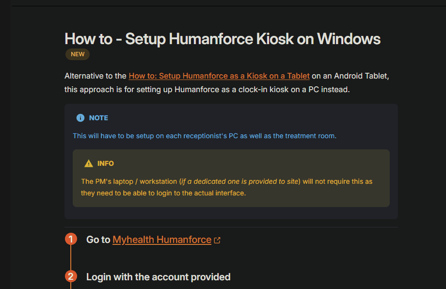
Who needs to click on a link to find out more? Not us anymore. Stay on the same page and preview the link to where it leads. For instance, , you just saw another page without leaving this page. Full detail, all the time.
Click me for the code
md
[hover over me](./IT-Documentation/Windows/Humanforce%20setup.md)This will only work on internal links. It will not work for external links.
TIP
With this change, it also helps let an you identify what an external link is by adding an icon to the hyperlink. Like . This will help you differentiate what is internal and what is external.
Open me for an example of it in use
In the event that you don't want to use an inline preview (This may be the case for internal downloads) you append { .no-inline-link-preview } to the link.
Click me for the code
md
[hover over me](./IT-Documentation/Windows/Humanforce%20setup){ .no-inline-link-preview }This now doesn't show a preview like before, this is useful in certain situations where we don't need a preview.
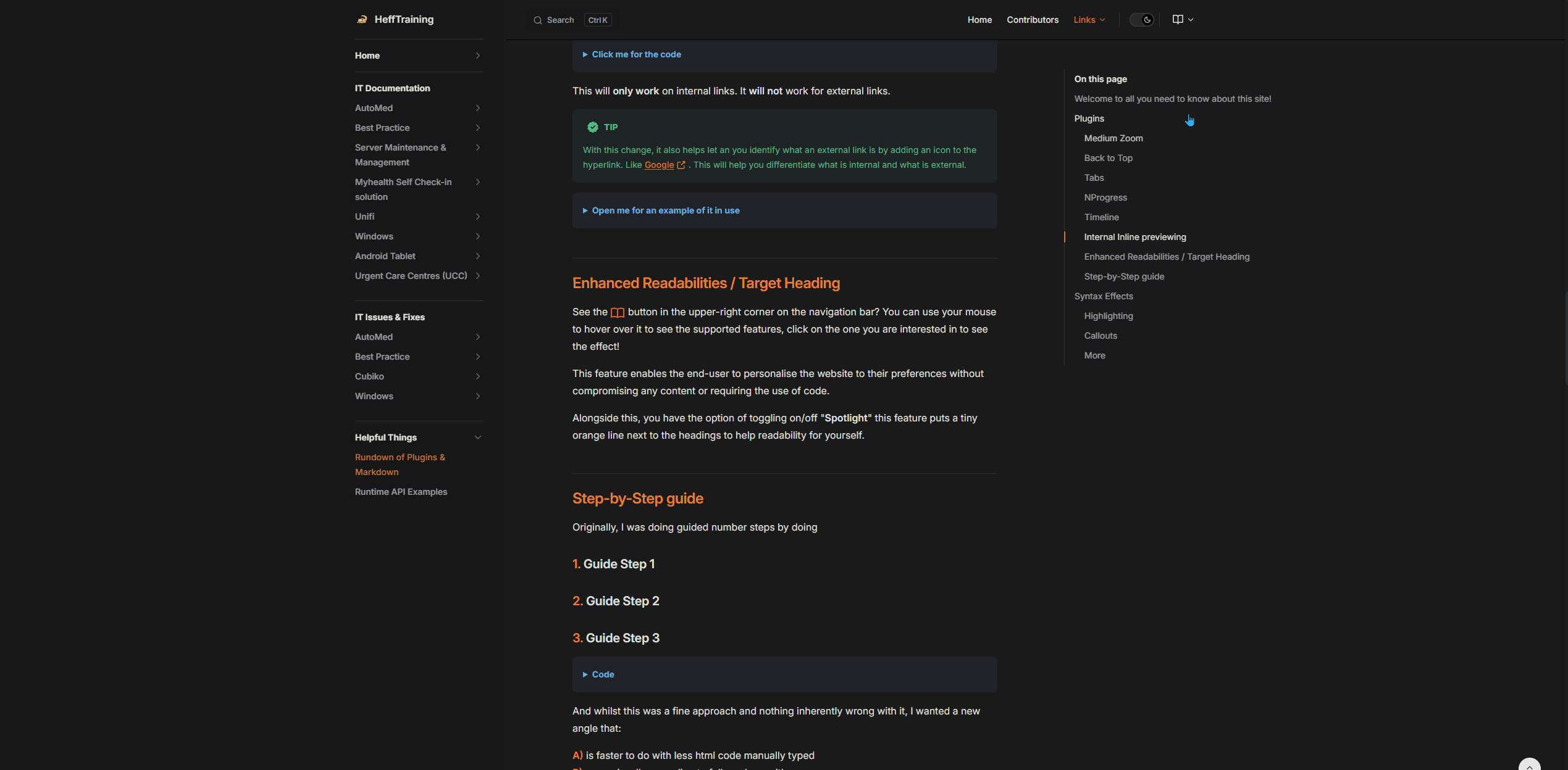
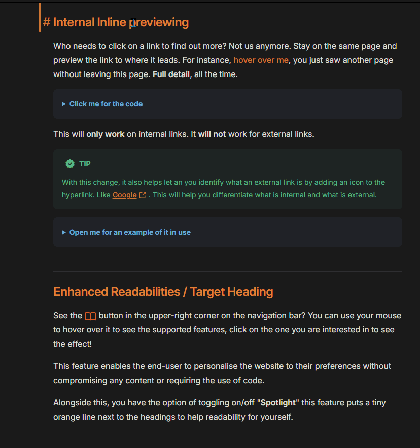
Enhanced Readabilities / Target Heading
See the button in the upper-right corner on the navigation bar? You can use your mouse to hover over it to see the supported features, click on the one you are interested in to see the effect!
This feature enables you to personalise the website to your preference without compromising any content or requiring the use of code.
Open me for a preview of the layout change
Alongside this, you have the option of toggling on/off "Spotlight" this feature puts a tiny orange line next to start of the text to aid you in your readings.
Open me for a preview of the Spotlight feature
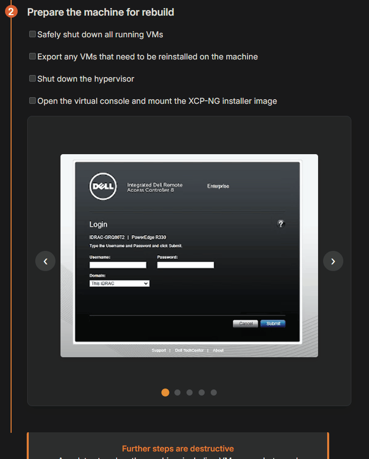
Step-by-Step guide
We've introduced a custom Step-by-Step guide system to enhance the readability and ease of following along with instructions. This system breaks down complex processes into manageable steps, making it easier for users to understand and execute tasks without feeling overwhelmed by large blocks of text.
How to Use the Step-by-Step Guide
- Step Container: Each step is wrapped in a
::: stepcontainer. This helps in visually distinguishing each step from the others. - Sub-Steps: If a step requires further breakdown, you can use
::: sub-stepto create sub-steps within the main step. - Last Step: The final step in the sequence should be marked with
::: step lastto reset the counter and ensure proper formatting.
Example
Here is an example of how to create a step-by-step guide:
1
This is step 1
Lorem Ipsum is simply dummy text of the printing and typesetting industry. Lorem Ipsum has been the industry's standard dummy text ever since the 1500s, when an unknown printer took a galley of type and scrambled it to make a type specimen book.
TIP
You can still add callouts without breaking any functionality.
1.1
Sub-step introduced
This sub-step provides additional details or actions that need to be taken. It helps break down the main step into smaller, more manageable tasks, ensuring clarity and ease of following the guide.
1.2
A secondary sub-step
Maybe you require more than one sub-step in your main step, add as many as you need.
2
This is step 2
Contrary to popular belief, Lorem Ipsum is not simply random text. It has roots in a piece of classical Latin literature from 45 BC, making it over 2000 years old. Richard McClintock, a Latin professor at Hampden-Sydney College in Virginia, looked up one of the more obscure Latin words, consectetur, from a Lorem Ipsum passage, and going through the cites of the word in classical literature, discovered the undoubtable source. Lorem Ipsum comes from sections 1.10.32 and 1.10.33 of "de Finibus Bonorum et Malorum" (The Extremes of Good and Evil) by Cicero, written in 45 BC. This book is a treatise on the theory of ethics, very popular during the Renaissance. The first line of Lorem Ipsum, "Lorem ipsum dolor sit amet..", comes from a line in section 1.10.32.

2.1
Sub-step straight under an image
As you can see from this example, you're able to implement your sub-styles anywhere. To allow for extra spacing, I did place a <br> just above.
3
This is step 3
It is a long established fact that a reader will be distracted by the readable content of a page when looking at its layout. The point of using Lorem Ipsum is that it has a more-or-less normal distribution of letters, as opposed to using 'Content here, content here', making it look like readable English. Many desktop publishing packages and web page editors now use Lorem Ipsum as their default model text, and a search for 'lorem ipsum' will uncover many web sites still in their infancy. Various versions have evolved over the years, sometimes by accident, sometimes on purpose (injected humour and the like).
Code
md
:::: step
### This is step 1
Lorem Ipsum is simply dummy text of the printing and typesetting industry. Lorem Ipsum has been the industry's standard dummy text ever since the 1500s, when an unknown printer took a galley of type and scrambled it to make a type specimen book.

::: tip
You can still add callouts without breaking any functionality.
:::

::: sub-step
#### Sub-step introduced
This sub-step provides additional details or actions that need to be taken. It helps break down the main step into smaller, more manageable tasks, ensuring clarity and ease of following the guide.
:::

::: sub-step
#### A secondary sub-step
Maybe you require more than one sub-step in your main step, add as many as you need.
:::
::::

::: step
### This is step 2
Contrary to popular belief, Lorem Ipsum is not simply random text. It has roots in a piece of classical Latin literature from 45 BC, making it over 2000 years old. Richard McClintock, a Latin professor at Hampden-Sydney College in Virginia, looked up one of the more obscure Latin words, consectetur, from a Lorem Ipsum passage, and going through the cites of the word in classical literature, discovered the undoubtable source. Lorem Ipsum comes from sections 1.10.32 and 1.10.33 of "de Finibus Bonorum et Malorum" (The Extremes of Good and Evil) by Cicero, written in 45 BC. This book is a treatise on the theory of ethics, very popular during the Renaissance. The first line of Lorem Ipsum, "Lorem ipsum dolor sit amet..", comes from a line in section 1.10.32.

<img src="https://i.pinimg.com/originals/84/29/94/8429942830ee706352fa51d1af23d503.jpg" width="150px"/>

<br>

::: sub-step
#### Sub-step straight under an image
As you can see from this example, you're able to implement your sub-styles anywhere. To allow for extra spacing, I did place a `<br>` just above.

:::

::: step last
### This is step 3
It is a long established fact that a reader will be distracted by the readable content of a page when looking at its layout. The point of using Lorem Ipsum is that it has a more-or-less normal distribution of letters, as opposed to using 'Content here, content here', making it look like readable English. Many desktop publishing packages and web page editors now use Lorem Ipsum as their default model text, and a search for 'lorem ipsum' will uncover many web sites still in their infancy. Various versions have evolved over the years, sometimes by accident, sometimes on purpose (injected humour and the like).
:::
INFO
This solution automatically calculates the main step and sub-step numbers. It also comes pre-styled, saving time when writing guides. It also resets the counter after identifying the last container.
TIP
::: step should be used used heading 3 (###) or as ::: step header: text here::: sub-step can be used with heading 3 (###) or heading 4 (####)
DANGER
The last main step requires the text "last" added to it's string ::: step last so that the counter can be reset and the line connecting the numbers doesn't go further than it should.
md
::: step
### This is step 1
This is some nomral text content
:::

::: step
### This is step 2
This is some nomral text content
<img src="././whatever"/>
:::

::: step last // [!code focus]
### This is step 3
This is some normal text content
<img src="././whatever"/> {align=center}

More content below if required
:::
Update 23/12/2024
We've now included built-in headers to make enhance the step guides.
You are capable of still using the ### as a title instead if you prefer to create links on the "On this page" area, however, if you'd prefer to hide these now write the below:
1
Wow a header
Lorem Ipsum is simply dummy text of the printing and typesetting industry. Lorem Ipsum has been the industry's standard dummy text ever since the 1500s, when an unknown printer took a galley of type and scrambled it to make a type specimen book.
1.1
A sub-step can still be introduced with the new implementation of step guides with headers.
1.2
Infact, multiple can be.
2
A second HEADER?!
Contrary to popular belief, Lorem Ipsum is not simply random text. It has roots in a piece of classical Latin literature from 45 BC, making it over 2000 years old.
3
Okay, no more
It is a long established fact that a reader will be distracted by the readable content of a page when looking at its layout. The point of using Lorem Ipsum is that it has a more-or-less normal distribution of letters, as opposed to using 'Content here, content here', making it look like readable English.
The code
md
::: step header:Wow a header // [!code focus]
Lorem Ipsum is simply dummy text of the printing and typesetting industry. Lorem Ipsum has been the industry's standard dummy text ever since the 1500s, when an unknown printer took a galley of type and scrambled it to make a type specimen book.

<br>

:::sub-step
A sub-step can still be introduced with the new implementation of step guides with headers.

<br>

:::sub-step
Infact, multiple can be.
:::

::: step header: A second HEADER?! // [!code focus]
Contrary to popular belief, Lorem Ipsum is not simply random text. It has roots in a piece of classical Latin literature from 45 BC, making it over 2000 years old.
:::

::: step last header: Okay, no more // [!code focus]
It is a long established fact that a reader will be distracted by the readable content of a page when looking at its layout. The point of using Lorem Ipsum is that it has a more-or-less normal distribution of letters, as opposed to using 'Content here, content here', making it look like readable English.
:::
The differences are: header:text are appended to create this.
Word count/Reading Time
You may have noticed the total word count and estimated reading time at the top of the page. While it may not be perfectly accurate for everyone, it is set to a reading speed of 200 words per minute (WPM) to provide a close estimate without flagging false data.
Typically, we read much faster in our heads:
The average reader can read 238 words per minute (WPM) while reading silently.
|
You can integrate this into any document at any point by using the following code:
md
<Wordcount/>IT IS CASE SENSITIVE
What does it look like?
It's pre-built with styling and enough padding at the bottom to ensure it doesn't interfere with other elements.
An example usage would be:
md
# {{ $frontmatter.title }}
<badge type="danger" text="STILL IN DEVELOPMENT"/>
<Wordcount/>
Higher is better
I would recommend keeping it as close to the top as possible to help readers.
Hyperlink Buttons
The Button component lets us create hyperlinked buttons within documentation. These buttons can help you direct you to important links or resources in a visually appealing way. Instead of regular text links, buttons stand out and make navigation easier.
Syntax
Here's the basic syntax:
md
<Button href="YOUR_URL" target="_blank">
  Button Text
</Button>

<Button href="YOUR_URL">
  Button Text
</Button>
NOTE
When creating button links, you can choose to open the link in the same tab or a new tab.
Example 1: Button with target="_blank"
The below button will open a new tab and direct straight to Google.
md
<Button href="https://google.com" target="_blank">
  Off to google
</Button>
Example 2: Button without target (Same Tab)
The below button will take you to Google in the same tab.
md
<Button href="https://google.com">
  Off to google
</Button>
Syntax Effects
Highlighting
VitePress provides Syntax Highlighting powered by , with additional features like line-highlighting:
Input
md
```js{4}
export default {
  data () {
    return {
      msg: 'Highlighted!'
    }
  }
}
```
Output
js
export default {
  data () {
    return {
      msg: 'Highlighted!'
    }
  }
}
Focus in Code Blocks
Adding the // [!code focus] comment on a line will focus it and blur the other parts of the code.
Additionally, you can define a number of lines to focus using // [!code focus:<lines>].
Input
md
```js
export default {
  data () {
    return {
      msg: 'Focused!' // [!!code focus] (remove one "!" this example shows 2 to allow it to be an example)
    }
  }
}
```
Output
js
export default {
  data() {
    return {
      msg: 'Focused!'
    }
  }
}
Callouts
Input
md
::: info
This is an info box.
:::

::: tip
This is a tip.
:::

::: note
This is a note.
:::

::: warning
This is a warning.
:::

::: danger
This is a dangerous warning.
:::

::: details
This is a details block.
:::
Output
INFO
This is an info box.
TIP
This is a tip.
NOTE
This is a note.
WARNING
This is a warning.
DANGER
This is a dangerous warning.
Details
This is a details block.
Sidebar Badges
You may notice while browsing, badges along some titles in the sidebar. or ? These are here to indicate what's newly published and things that are no longer in use.
Why this feature?
I was unable to utilise Vitepress's badge solution
TIP<badge type=tip text="TIP"/> orDANGER
<badge type=danger text="DANGER"/>as . components can't be supported within the sidebar, but plain HTML can.
The solution
With a simple <span class=""/> and CSS styling targeted to that class specifically. Allowing even more creative freedom. We are also able to add as many classes as we wish and style them individually. (With light and dark mode in mind)
html
{ text: 'SQL Errors for Docpay <span class="new"/>',Click me for the CSS
css
.new::before {
  content: "NEW";
  display: inline-block;
  padding: 0.25em 0.4em;
  font-size: 85%;
  font-weight: 500;
  line-height: 1;
  text-align: center;
  white-space: nowrap;
  vertical-align: baseline;
  border-radius: 0.375rem;
  color: var(--vp-custom-block-tip-text-deep);
  background-color: var(--vp-custom-block-tip-bg)
}

.deprecated::before {
  content: "DEPRECATED";
  display: inline-block;
  padding: 0.25em 0.4em;
  font-size: 85%;
  font-weight: 500;
  line-height: 1;
  text-align: center;
  white-space: nowrap;
  vertical-align: baseline;
  border-radius: 0.375rem;
  color: var(--vp-c-danger-1);
  background-color: var(--vp-badge-danger-bg)
}
How do you apply this yourself?
You have to add the span class to the config.mts text
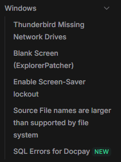
Open me for an example
ts
      {
        text: 'Windows',
        collapsed: true, // Setting it to false to expand "Windows" by default
        items: [
          { text: 'Thunderbird Missing Network Drives', link: '/docs/IT-Issues-Fixes/Windows/Thunderbird-missing-Network-Drives' },
          { text: 'Blank Screen (ExplorerPatcher)', link: '/docs/IT-Issues-Fixes/Windows/Blank-screen' },
          { text: 'Enable Screen-Saver lockout', link: '/docs/IT-Issues-Fixes/Windows/Windows-Personalisation' },
          { text: 'Source File names are larger than supported by file system', link: '/docs/IT-Issues-Fixes/Windows/Source-Files' },
          { text: 'SQL Errors for Docpay <span class="new"/>', link: '/docs/IT-Issues-Fixes/Windows/SQL-errors-docpay' },
        ]
      },
Doing the above step would result in the below
Acknowledge content
We've developed a way to require acknowledgement before displaying some content. This feature serves several important purposes for both the writers and readers.
This feature is designed with both the writers' and the readers' best interests in mind. It helps us deliver clear, concise, and crucial information effectively, while also giving readers the opportunity to fully grasp the content and its implications before proceeding.
How to create this
To do this, in a markdown file we'll write some content:
md
---
title: Some title
description: Cool, a description of the page!
search: yes
---

# {{ $frontmatter.title }}
<badge type="danger" text="FIRST DRAFT"/>

***
:::: step
### <span class="red">Wow</span> content</span>
::: tip
Even a tip to aid in this step
:::
<img src="./whoknows/wherethisleads.png"> {align=center}
<!---->
::::

::::: step last
### Okay so we <span class="red">have some</span> > <span class="red">steps</span> > <span class="red">that users</span> > <span class="red">have to follow</span>

<img src="./whoknows/wherethisleads.png"> {align=center}

:::: details big explanation
all to be wrapped in a codeblock
<img src="./whoknows/wherethisleads.png"> {align=center}
::::
:::::
With that done, we need to wrap the content we want to be acknowledged and hidden. To do this, we'll write <CriticalNote> anywhere we need to start the acknowledgment, but we need and end as well. Make sure to write </CriticalNote> where it needs to end.
md
---
title: Some title
description: Cool, a description of the page!
search: yes
---

# {{ $frontmatter.title }}
<badge type="danger" text="FIRST DRAFT"/>

<CriticalNote> // [!code focus]

***
:::: step
### <span class="red">Wow</span> content</span>
::: tip
Even a tip to aid in this step
:::
<img src="./whoknows/wherethisleads.png"> {align=center}
<!---->
::::

</CriticalNote> // [!code focus]

::::: step last
### Okay so we <span class="red">have some</span> > <span class="red">steps</span> > <span class="red">that users</span> > <span class="red">have to follow</span>

<img src="./whoknows/wherethisleads.png"> {align=center}

:::: details big explanation
all to be wrapped in a codeblock
<img src="./whoknows/wherethisleads.png"> {align=center}
::::
:::::
Once you have wrapped what you needed to in that acknowledgment, by default it will show:
md
<CriticalNote>

</CriticalNote>
It is important that you change this message to what you need, this is customisable and uses HTML.
html
<CriticalNote>
  <template #message>
    <strong>Change this to whatever you'd like!</strong>
  </template>
DO NOT ADD EXTRA LINE SPACES. WRITE IT EXACTLY AS SHOWN ABOVE
After that, your message will change
Click me for the code
html
<CriticalNote>
<template #message>
  <strong>I have now changed this</strong>
</template>
TA DA
</CriticalNote>